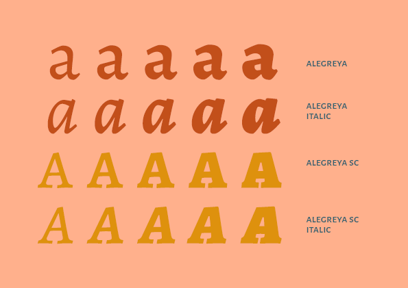
alegreya font sample
about the project
This project was made during a Typography class (Graphic Design - IESB) conducted by professor Henrique Eira.
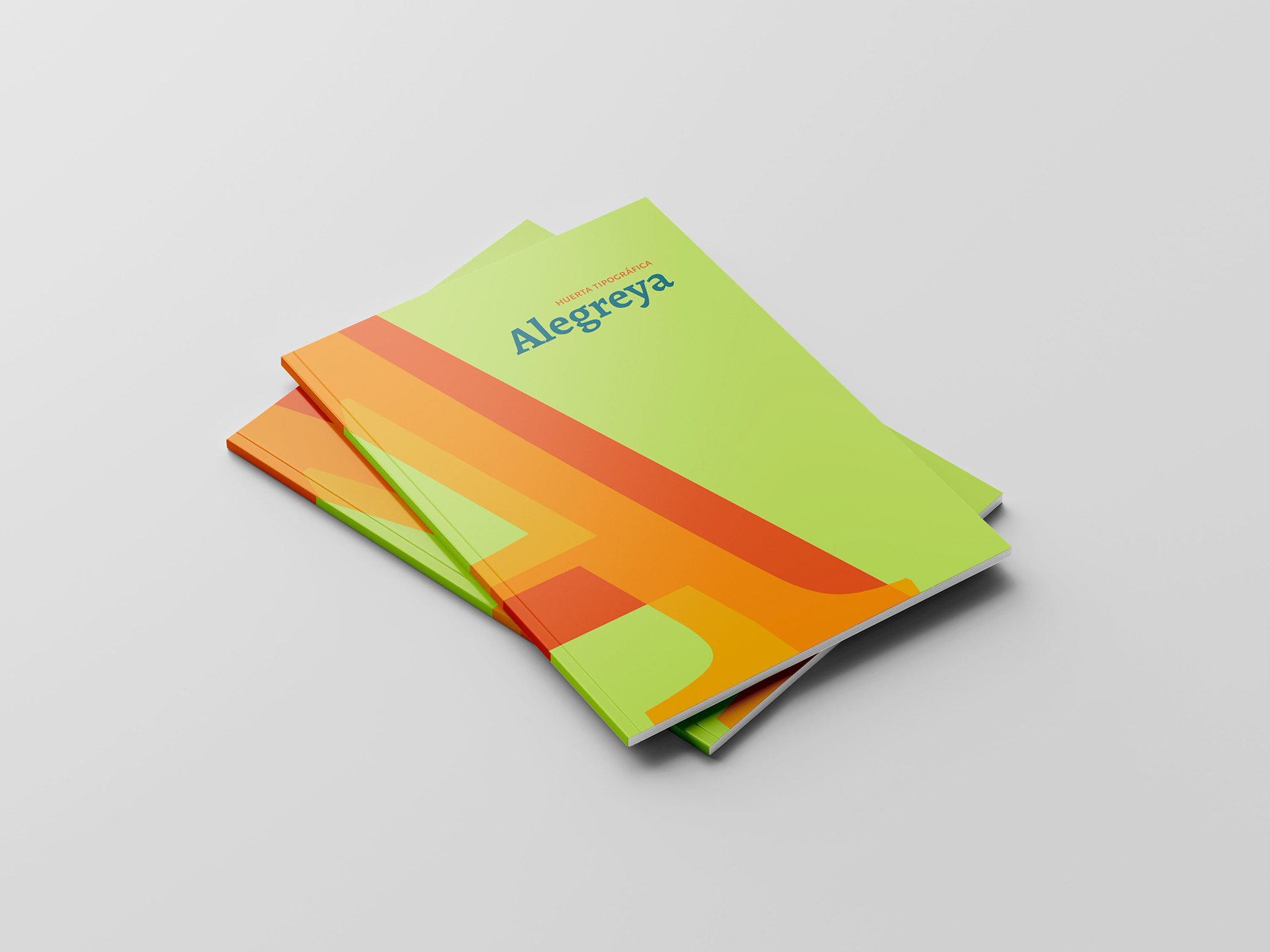
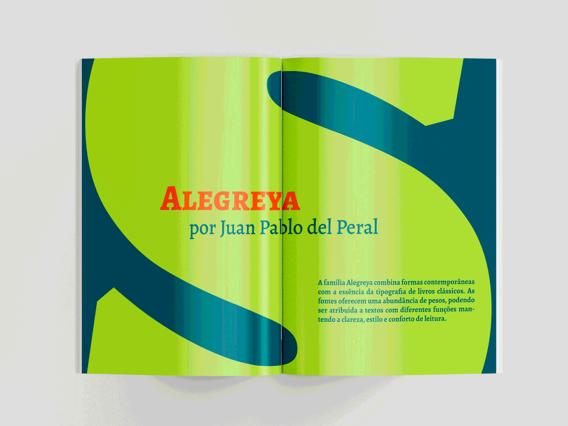
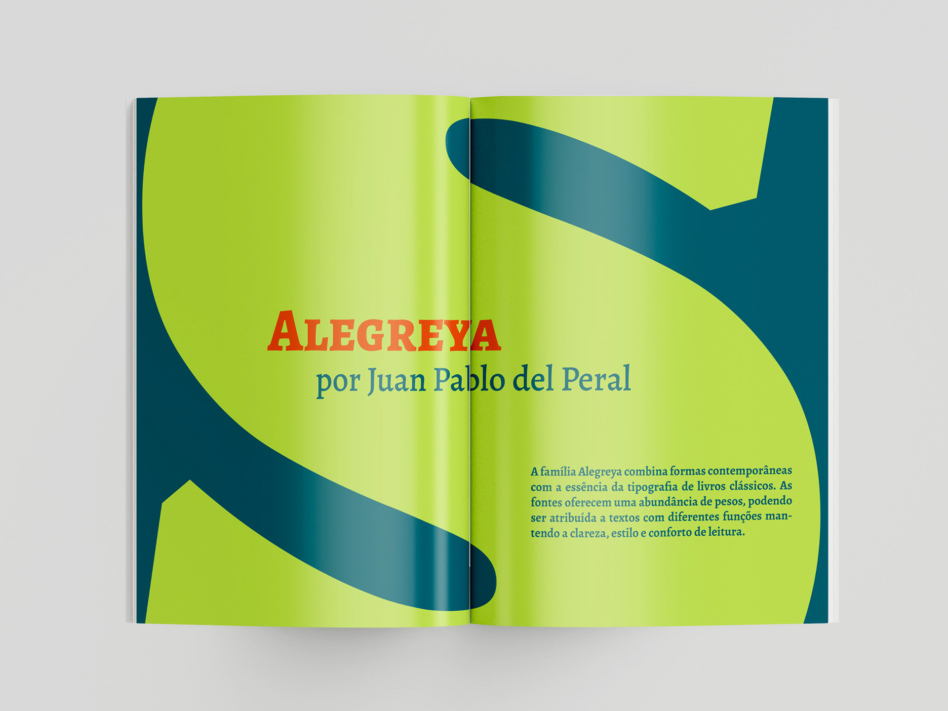
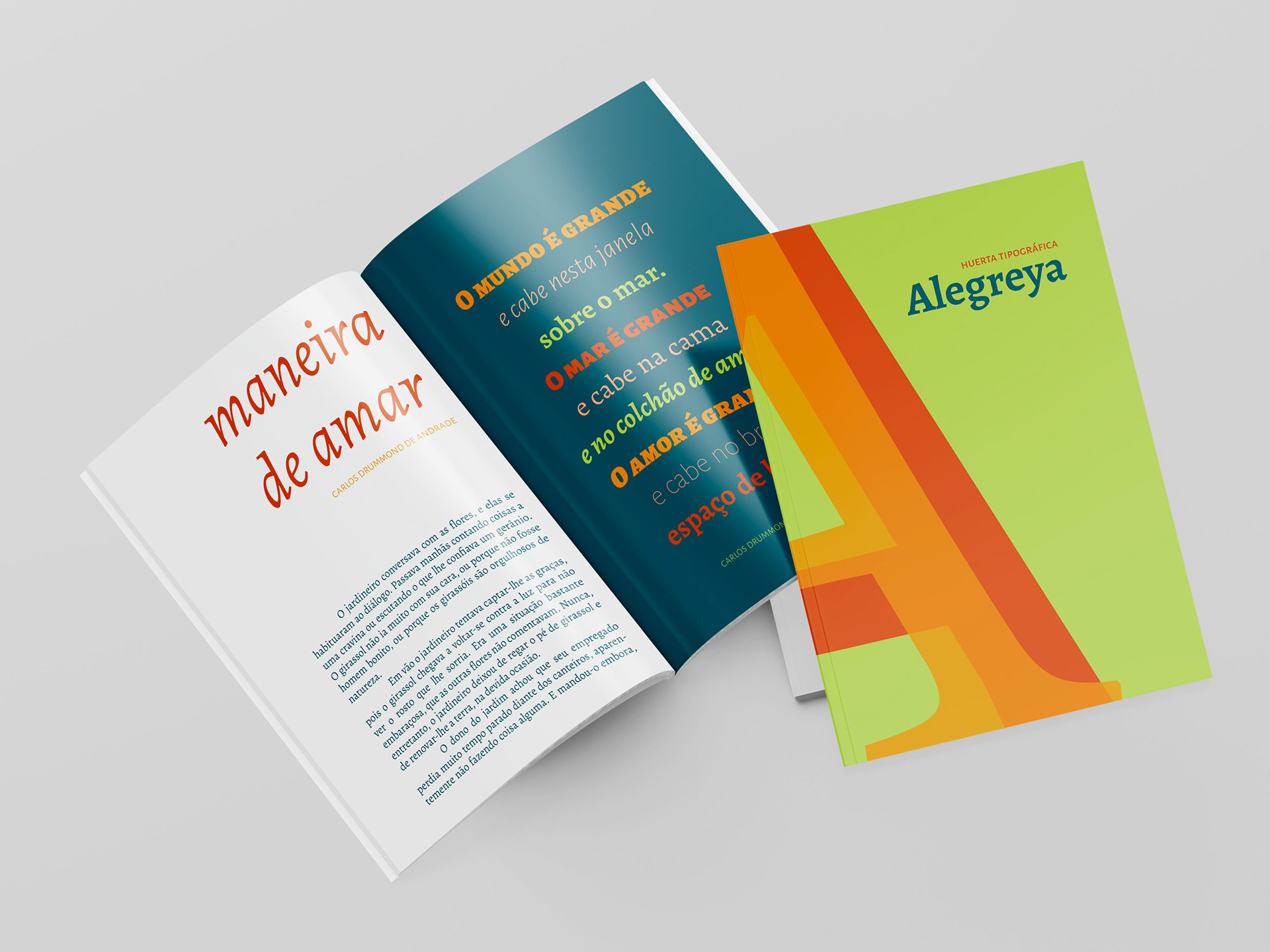
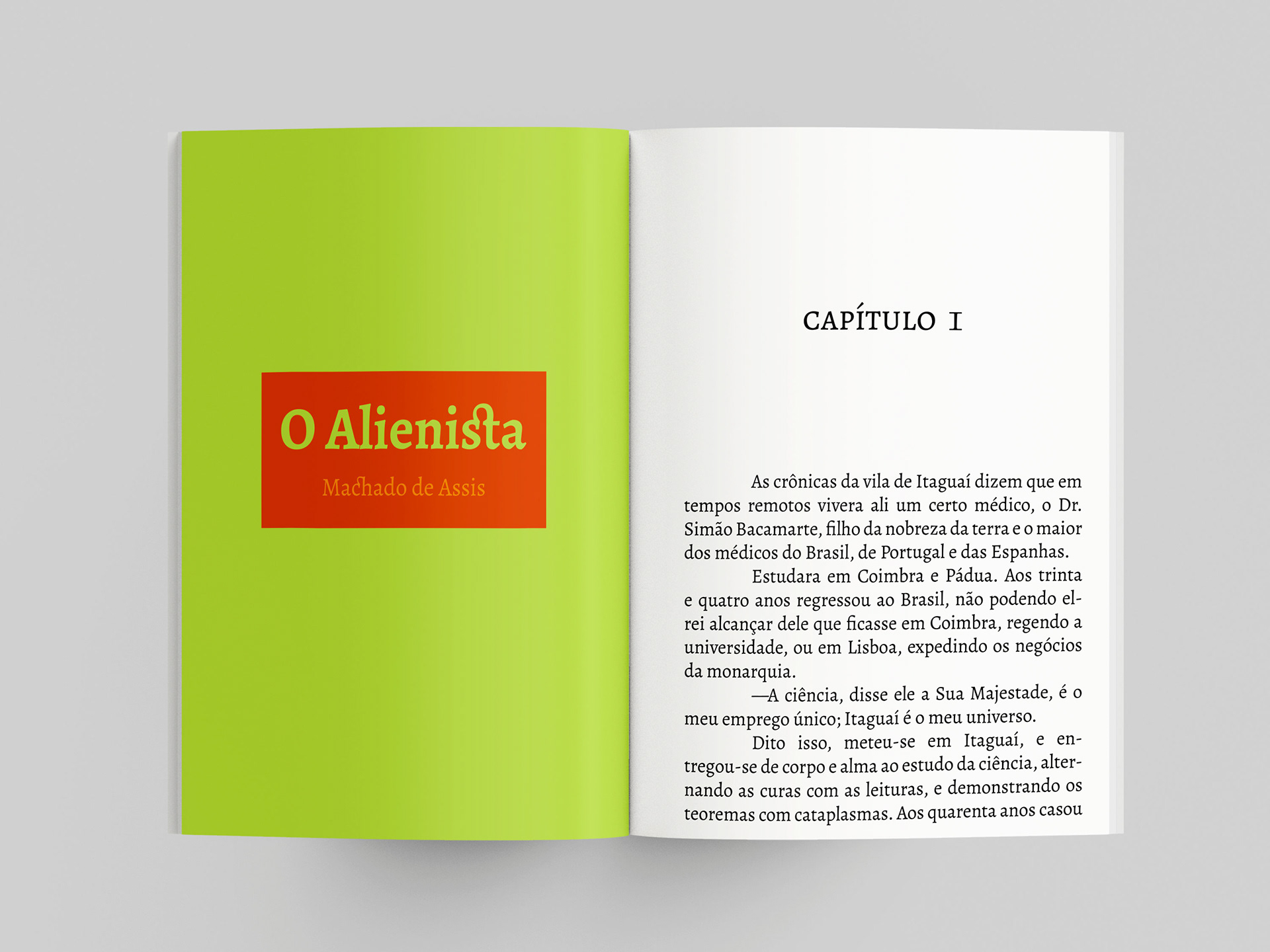
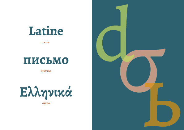
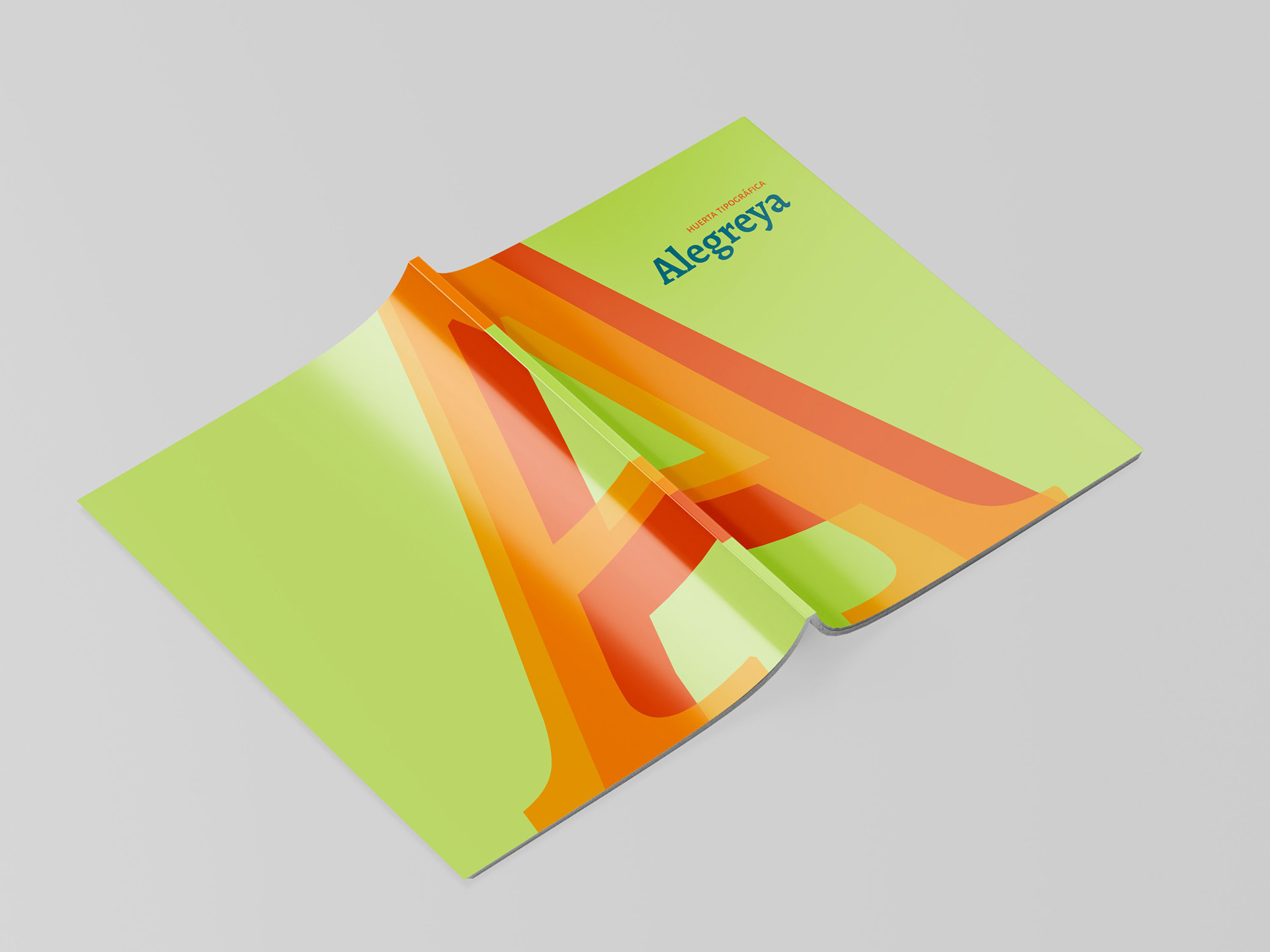
In this class, I was introduced to the concept of a font sample, a document or image meant to show the font variations, uses and characteristics. It is used by designers to help them choose between fonts, but it also shows the potencial the font has. This exercise had the goal of exploring contrast and layout in typography with one specific existing font. I chose the Alegreya Family by the foundry HUERTA TIPOGRÁFICA (Argentina).
process
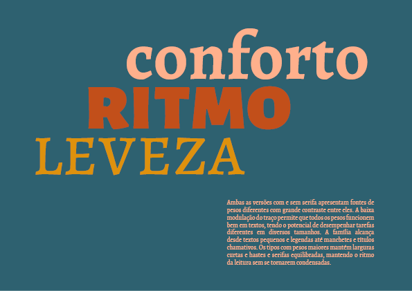
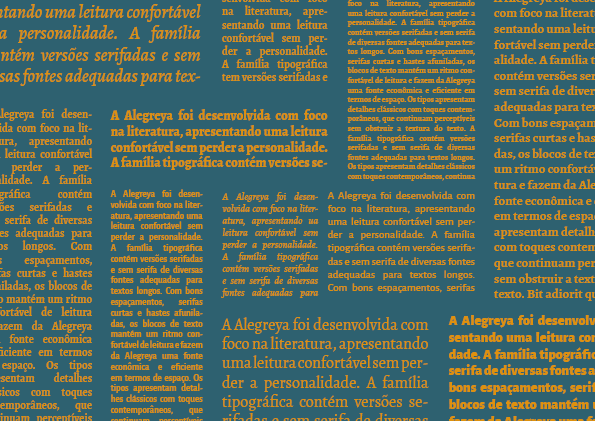
The Alegreya Family is considered a super family, having four sister families, each with many variations of weights. It has serif and sans-serif fonts and their corresponding all-caps. The Alegreya Family brings a contemporary form with calligraphic feel, as it was thought out to be a dynamic, rhythmic font for long texts and still have a touch of classic literature books.
With that in mind, I knew I had a very versatile font at hands. I started exploring different weights and sizes with big blocks of text. I made some book pages mockups and collages to show the difference between each one. After that I started adding the titles, and soon noticed how many different styles could be achieved with this family. I continued escalating the size, impact and contrast until I was comfortable with the amount of variations I had.
The next step was to figure out the structure of the content so I could present the font with a solid storyline and proposal. It ended up with two main parts, the technical information that show the fonts and weights and the different applied examples, intercalated with abstract pages where I made prints with characters and glyphs (which ended up to be my favorites!).