diversity on screen - the oscar's
about the project
This project was developed during a workshop called infografia, dataviz e infodesign: conceitos e prática (conduced by Rodolfo Almeida).
In this workshop I was introduced to many different data visualization techniques. The exercises helped me explore different types of graphs, maps and diagrams all while being conscious os design and accessibility.
process
For this project, I was given a large and imperfect dataset on diversity in the Oscar's. We learned a fews techniques to clean the data and reorganize before moving on the exploring and making the visualizations.
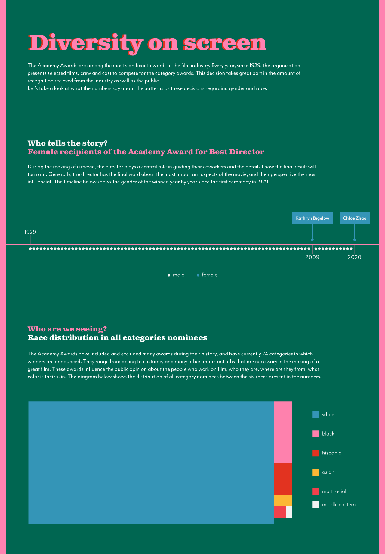
This is a subject of great political and personal interest for me, being a latinx woman who's very interested in film. That's why I knew straight away I wanted to explore gender and race in the data. I had different difficulties with each of the two graphs; the first was really important to me, since my childhood dream was to be a film director and all these years I never saw a woman win the award. I saw the data and knew the distribution was drastic, so I decided to bring a lot of attention to the only two winners*. The second graph was my first time making a treemap, and I love how well it showed the distribution between races.
* As of march 2022, we have one more female winner! Soon I will be happy to update the viz.