the numbers of the titanic
about the project
This project was developed during a workshop called infografia, dataviz e infodesign: conceitos e prática (conduced by Rodolfo Almeida).
In this workshop I was introduced to many different data visualization techniques. The exercises helped me explore different types of graphs, maps and diagrams all while being conscious os design and accessibility.
process
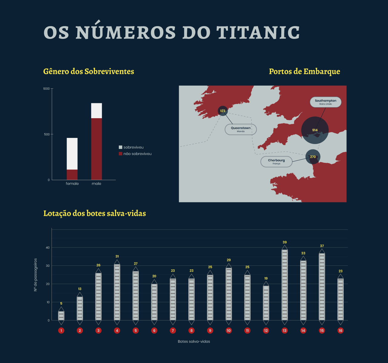
This was the first time I had contact with public databases, being the start of my dataviz journey. It was really exciting getting to explore the data and having the freedom to choose what I wanted to show. I made that decision based on the types of visualizations I was ready to try and knew how to work the data. This was also the first time I could make graphs and be experimental with the design. I ended up using a nautical palette with lots of contrast and a simple, sans-serif font for all the information and numbers. In the last bar graph, I played with the idea of presenting the bars as if they were lifeboats, with the size being the amount of people in each boat. I was really satisfied to be doing something different, even though I know it was a risk!